Create Scrolling CSS3
Scrolling can save a lot of space, and can be very delicately handled in CSS3, coupled with the power of CSS Sprites image and some math, we will turn this image below into the rotating banner.
CSS
<style type="text/css">/*Sprite Backgrounds*/.smFbk64{background-position: 0px -0px}.smTwi64{background-position:-66px -0px}.smGoo64{background-position:-132px -0px}.smLin64{background-position:-198px -0px}.sm64{width:64px;height:64px;display:inline-block;overflow:hidden;background-image: url('https://www.claytabase.co.uk/Academy/Learning-Web-Design/Using-CSS/Create-Scrolling-CSS/SocialMedia_64.png');background-repeat:no-repeat;}.rnd50{border-radius:50%}/*Moving Parts*/.parentDiv{width:64px;height:64px;overflow:hidden;margin:auto}.followDiv{width:320px;height:64px;position:relative;animation:followDivSlide ease infinite 10s;-webkit-animation:followDivSlide ease infinite 10s;-moz-animation:followDivSlide ease infinite 10s;-webkit-animation-fill-mode:forwards;-moz-animation-fill-mode:forwards;animation-fill-mode:forwards;}@keyframes followDivSlide{from{left:0px;}15%{left:0px;}25%{left:-64px;}40%{left:-64px;}50%{left:-128px;}65%{left:-128px;}75%{left:-192px;}90%{left:-192px;}to{left:-256px;}}@-webkit-keyframes followDivSlide{from{left:0px;}15%{left:0px;}25%{left:-64px;}40%{left:-64px;}50%{left:-128px;}65%{left:-128px;}75%{left:-192px;}90%{left:-192px;}to{left:-256px;}}@-moz-keyframes followDivSlide{from{left:0px;}15%{left:0px;}25%{left:-64px;}40%{left:-64px;}50%{left:-128px;}65%{left:-128px;}75%{left:-192px;}90%{left:-192px;}to{left:-256px;}}</style>/*HTML*/<div class="parentDiv"><div class="followDiv"><a class="sm64 rnd50 smFbk64" href="https://www.facebook.com/Claytabase"></a><a class="sm64 rnd50 smTwi64" href="https://twitter.com/claytabase"></a><a class="sm64 rnd50 smGoo64" href="https://plus.google.com/+ClaytabaseCoUk"></a><a class="sm64 rnd50 smLin64" href="https://www.linkedin.com/company/claytabase-ltd"></a><a class="sm64 rnd50 smFbk64" href="https://www.facebook.com/Claytabase"></a></div></div>The Sprite
The image is 8x64 wide and 8x64 high images combined as an image 658px wide and 196px high, we are only interested only the first 4 images at the moment.
We create 4 CSS classes for each of them to create using the shorthand background property.
As you can see the image has a space of 2px between each image, so we add that to the position, -68px etc.
We can also choose 2 common classes to use all the items, they set the limit radius and the size of each item.
We can also choose 2 common classes to use all the items, they set the limit radius and the size of each item.
The Container
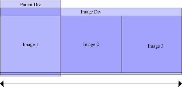
This is a simple div, which is exactly the same width and height (64x64) as the images defined above, we set overflow to hidden to hide the rest of the child.
Parent Div Example
The Child/Children
This is the second div which is moved in the CSS. We set the height to 64px, but this time be the width must 64px * 4 giving us a total of 256px.
In this example we want to replicate the first Sprite appear at the end, to prevent a sudden jerk between Facebook and Linked In, so adjust the width to 320px.
The Animation

Our animation then moves the div to positions of 0px, -64px, -128px, -192px and -256px so that only the one item is visible at any point during movement. See below for an example, without overflow, and on the right side for an illustration of how the positioning moves each element.
