Setting Social Media Images
Setting your brand
Branding can be set in a number of ways, the most visible on the web tends to be what your visitors see when content is shared. Most big companies have this outsourced, but it isn't that difficult to do yourself if you follow a few simple rules.
We are going to investigate a few common areas:
- Sharing
- Header/Banner
- Profile/Logo
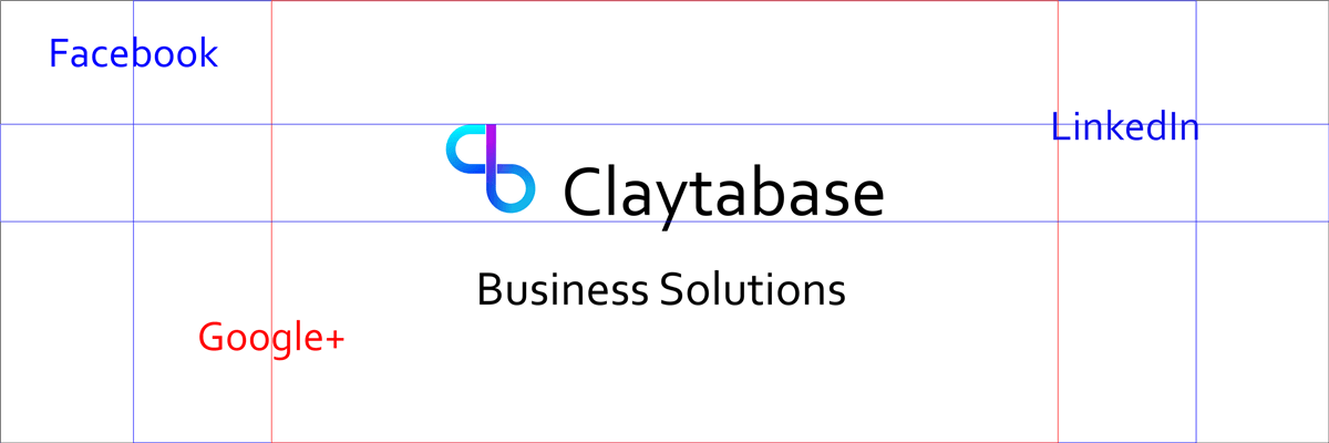
When our content is shared, we use the following image which is set in the system menus to give you a default, and then can be adjusted on a page by page basis.

As you can see it is a fairly large image, and the reason for this is that it looks better on high definition mobile devices. In our case we use a default image that is a padded version of our logo.
Sharing
There are two options dependent on how you want your items viewed, and both can be used effectively, but it is most effective using the same approach across all platforms.
Full Image
A larger image that scales the full width of your post or tweet.
There is a hack here where you can use the same image across all platforms. Create your image to be 1200px wide, and then 675px tall, including an area both top and bottom of about 25px that can be cropped acceptably.
Square Thumbnail
Most scale an image that doesn't meet their criteria into a square thumbnail. This can be a perfectly viable option, so to choose this simply set a square image as your default. We had this as our setting for a while with our logo.
Facebook & LinkedIn
Full Image
For full image rendering on Facebook, you need an image of 1200px wide by 630px tall.
Thumbnail
Images that don't meet that criteria look as though they get cropped into a thumbnail, so make sure that it is square.
Using Ousia and further reading
In the Social Media menu, add the URL of the image you want to display to the Social Media Image
Facebook specifications: Best Practices
We couldn't find a LinkedIn page with actual specifications, but they are on this help page
Full Image
Twitter ask for an image that is 1200px wide and 675px tall, and for a meta tag to be added. <meta name="twitter:card" content="summary_large_image">
Thumbnail
As with Facebook, other images get rendered as a square thumbnail
Using Ousia and further reading
In the Social Media menu, add the URL of the image you want to display to the Social Media Image option, and add summary_large_image to the Twitter:Card option.
View their full specifications here: Optimize Tweets with Cards
Google +
Full Image
Wider than 400px and an aspect ratio of at least 5.2:1 (about 155px).
Thumbnail
It looks as though other images are served as thumbnails, so make them square.
Using Ousia and further reading
In the Social Media menu, add the URL of the image you want to display to the Social Media Image option.
Googles specifications can be found here: Article Rendering
Banner Sizes
We designed for Google+ and padded up to the size of our twitter image. Once we had that scale we then doubled the size for an image of 3000px by 1000px.
Width 820px, height 340px. Ensure the bottom 75 pixels or so can be cropped with no effects
Linked in use wider images, as such the minimum size is 1536px tall by 768px wide, however you then have to re position. The envelope in which to put text is pretty small making it hard to position, ideally they may bring themselves into line with the others.
They recommend 1500px wide by 500px tall. We have used this as a basis for the rest.
Google+
Seems to go with the flow, the twitter image fitted in nicely. The ideal size is stated to be 1080px by 608px.

Profile Picture
As with your banners, it is best to design for twitter, so create a square image of at least 400px.
Profile pictures are square and need be uploaded with dimensions of at least 180px, any image used can be cropped at upload.
Profile again square, 300px recommended.
Twitter 400px recommended.
Google+
Again square, 270px recommended.
Social Media Meta Data
In the next article, we look at how to tell the social media platforms what image to display.